
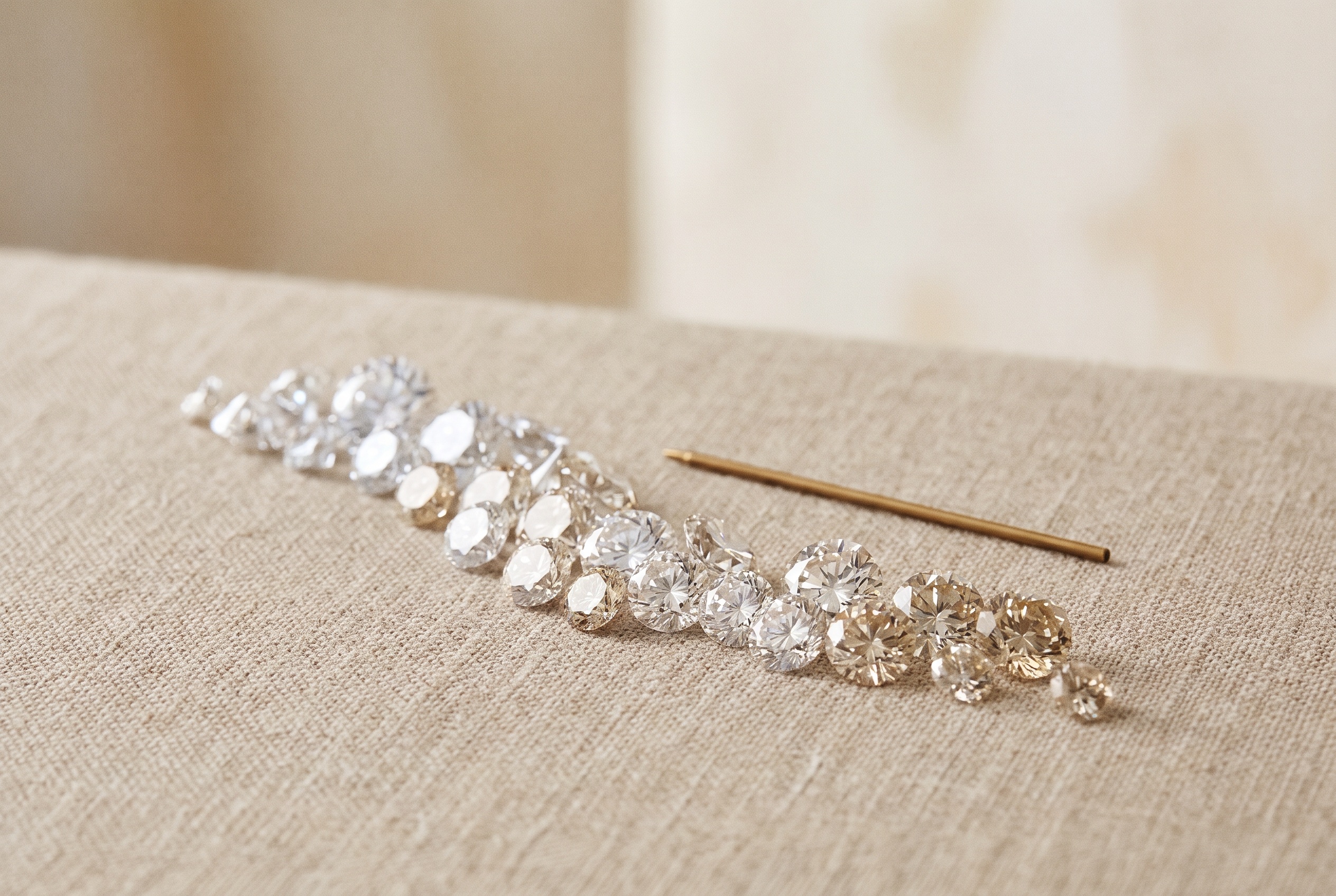
A diamond color chart is the visual reference tool — usually a printed or digital strip running D through Z — that lets buyers compare a diamond's certified color grade against a known standard, or compare multiple stones against each other, without relying on memory or store lighting. It's the practical companion to the D-to-Z grading scale: the scale defines the system, the chart is what you actually hold up next to a stone.
This guide is built for that second use case — not "what does each grade mean" in the abstract, but how a color chart actually gets used at the point of comparing and buying real diamonds: reading it letter by letter, understanding what a master stone is and why it anchors the whole system, how to view stones against a chart correctly, where GIA, IGI, and AGS charts diverge, how color grade tracks with price as you move across the chart, and how to use a chart when a natural stone and a lab-grown stone are sitting side by side. For the full explanation of why the scale exists and how color forms in a diamond, see our companion piece on the diamond color scale — this post picks up where that one leaves off.
Diamond Color Chart vs. Diamond Color Scale: What's the Difference?
These two terms get used interchangeably, but they describe different things. The color scale is the grading system itself — the concept that diamonds are ranked D through Z by decreasing colorlessness, graded by a lab against controlled standards. The color chart is the physical or visual tool that represents that scale in a usable format: a strip, a table, a printed card, or a set of reference images ordered by letter, meant to be looked at and compared against.
In practice, a color chart is what a buyer actually uses in the moment of decision-making. Nobody compares two diamonds by reciting the grading philosophy behind D-to-Z — they lay a chart or a set of comparison stones next to the diamonds in front of them and look. Understanding the scale (covered in depth in the diamond color scale guide) tells you what the letters mean. Knowing how to use a chart tells you how to actually apply that knowledge when two stones are on the table and you need to decide between them.
The Full D-to-Z Diamond Color Chart, Letter by Letter
Most explainers group the scale into ranges (D–F, G–J, and so on), which is useful for understanding the system but not always precise enough when you're comparing individual stones on a chart, since two letters in the same "range" can still be meaningfully different from each other at scale. Here is every letter on the chart, one row at a time:
| Letter | Category | What It Looks Like on the Chart | Chart-Reading Note |
|---|---|---|---|
| D | Colorless | Absolute reference white — the top anchor point of the chart | No warmer letter is compared against D; everything else is compared downward from it |
| E | Colorless | Effectively identical to D on the chart to an untrained eye | Distinguishable from D only by a trained grader under controlled comparison |
| F | Colorless | Still reads as pure white; last letter in the colorless tier | The D–F boundary at F–G is the first meaningful pricing step down the chart |
| G | Near Colorless | First letter where a hint of warmth can theoretically be isolated under lab conditions | Most charts mark G as the practical "starts here" point for value buyers |
| H | Near Colorless | Visually near-indistinguishable from G on a chart without side-by-side reference | The most commonly requested single letter in wholesale near-colorless orders |
| I | Near Colorless | A faint warmth becomes theoretically detectable at this point on the chart | Still reads white face-up in the vast majority of settings and sizes |
| J | Near Colorless | Last letter in the near-colorless tier; warmth starts to be visible in larger stones | The J–K line is where a chart comparison against a colorless anchor starts to separate for most viewers |
| K | Faint | A light warm tint, visible on the chart without needing a side-by-side comparison | First letter where the tint is often described as "warm" rather than "off-white" |
| L | Faint | Warmth slightly more pronounced than K on the chart | Common trade-off point for buyers prioritizing size over whiteness |
| M | Faint | Last letter before tint becomes clearly visible without comparison | Closes out the faint tier on most standard charts |
| N | Very Light | Tint is visible unaided at this point on the chart | Rare to see requested for center stones on a wholesale order |
| O | Very Light | Deeper tint than N, still in the yellow-brown range | Charts sometimes compress N–R into a single visual band since the step differences are subtle |
| P | Very Light | Continued progression of visible tint | Appears on full charts more than on simplified retail versions |
| Q | Very Light | Approaching the deepest point of the "very light" tier | Uncommon in center-stone wholesale sourcing |
| R | Very Light | Last letter before the "light" tier | Closes out the very light band on a full-scale chart |
| S | Light | Clearly visible tint at the start of the deepest standard tier | Begins the S–Z band, where some full charts start compressing letters visually |
| T | Light | Progression continues toward deeper tint | Appears mainly on full lab-issued charts, not simplified consumer versions |
| U | Light | Deeper tint, approaching the lower end of the standard scale | Rarely stocked as center-stone inventory in the trade |
| V | Light | Tint continues to deepen | Present on full grading-lab charts for completeness |
| W | Light | Near the bottom of the standard D-to-Z chart | Occasionally confused visually with fancy light yellow on an incomplete chart |
| X | Light | Deep, clearly visible tint | Approaching the point where fancy-color grading becomes the more relevant scale |
| Y | Light | Deepest standard letter before Z | Some charts note Y as a transition point toward fancy-color territory |
| Z | Light | The bottom anchor of the standard D-to-Z chart | Beyond Z, diamonds are graded on the separate fancy-color scale, not D-to-Z |
A few letters carry more weight when actually reading a chart at the point of comparison than their neighbors do. F–G, J–K, and M–N are the three boundaries where a chart-based side-by-side comparison most often produces a visible difference to an untrained eye, because they mark the transitions between tiers rather than a step within one. If you're scanning a chart quickly to decide where to draw a line for a given order, those three boundaries are the ones worth slowing down on.
How a Color Chart Is Actually Used When Buying or Comparing Stones
In a wholesale or trade setting, a color chart rarely gets used to grade a diamond from scratch — that's the lab's job, done under conditions no buyer replicates in an office. What a chart is actually for is comparison: confirming a certificate's stated grade looks right, lining up multiple stones from different parcels or suppliers against a common reference, or checking that a batch of melee reads consistently before it ships in a single setting.
The practical workflow looks like this:
- Anchor first. Start with a stone (or printed reference) of known, verified grade at one end of the range you're comparing — typically the top of the tier you're shopping in.
- Compare in sequence, not in isolation. Color perception drifts the longer you stare at a single stone; a chart or reference set is only useful when stones are viewed in quick succession against the same anchor, not evaluated one at a time from memory.
- Match lighting to the chart, not the room. A chart calibrated for daylight-equivalent lighting will mislead under warm showroom bulbs — see the viewing section below.
- Note the boundary, not just the letter. When a stone reads "close to H, maybe I," that boundary information is often more useful for a buying decision than forcing a single letter — especially when you're deciding whether the stone will pass for a specific setting.
This matters more at volume than it does for a single stone. A buyer sourcing one center diamond can lean entirely on the certificate. A buyer comparing twenty stones across three suppliers to build a matched set, or verifying a parcel before committing to a repeat order, needs the chart as an active comparison tool — which is also why matching pairs sourcing depends on chart-based comparison more heavily than single-stone sourcing does.
Master Stones: The Physical Anchors Behind Every Color Chart
A printed or digital color chart is a representation — the real anchor behind every diamond color chart is a set of master stones. These are physical diamonds of independently verified, fixed grade, kept by grading labs specifically to compare unknown stones against under controlled lighting. When a lab grades a diamond, the process isn't "look at the stone and assign a letter from memory" — it's placing the unknown stone directly next to a master stone of a known grade and observing where it falls relative to that anchor.
This is worth understanding because it explains why a printed chart, however accurate, is always one step removed from the actual grading process. A printed or on-screen chart is calibrated to represent what master-stone comparison would show, but it can't replicate physical, side-by-side viewing under identical light with an actual reference diamond. That's part of why buyers who need to make a real go/no-go call on a batch of stones — rather than just double-check a certificate at a glance — often keep a small set of physical reference stones of known grade in-house, essentially building a mini master-stone set for their own comparison purposes, rather than relying on a printed chart alone.
The takeaway for anyone using a chart: treat it as a close approximation of the master-stone method, not a replacement for it. For quick verification and comparison across a handful of stones, a good chart is more than sufficient. For grading decisions that carry real cost — a large parcel, a matched set going into visible jewelry — physical reference stones are the more reliable tool.
How to Visually Compare a Color Chart Against Real Diamonds
Color reading is unreliable under the wrong conditions, and most of the mistakes buyers make when comparing a chart against a real stone come down to viewing setup rather than the chart itself. A few practical rules:
- Use a stark white, non-reflective surface. A plain white paper or grading tray — never a colored countertop, patterned fabric, or anything with a warm or cool cast — is the baseline every chart assumes. Any background color bleeds into how the stone's own color reads.
- View the stone table-down, not face-up. Color concentrates in the pavilion, and viewing a diamond through its side or back (rather than face-up through the table) shows tint far more clearly than the face-up view most buyers default to.
- Match your light source to daylight-equivalent, around 5,500–6,500K. Warm incandescent bulbs (common in retail showrooms) push everything toward yellow and can make a near-colorless stone look warmer than it is, or mask real tint in a lower grade entirely. A daylight-balanced lamp or a north-facing window with indirect light is the closest most buyers get to lab conditions without specialized equipment.
- Compare stones in quick succession, not one at a time from memory. The eye adapts to whatever it's looking at within seconds — a stone viewed alone for thirty seconds can start to look whiter or warmer than it actually is simply from adaptation. Move between stones (or between a stone and the chart) quickly and repeatedly rather than staring at one and trying to recall the chart afterward.
- Unmount when possible. A mounted stone's color reads differently depending on the metal underneath it — yellow gold warms the apparent color, platinum and white gold do the opposite. A chart comparison is only apples-to-apples on a loose, unmounted stone.
None of this replaces a lab's controlled environment, but it's the difference between a chart comparison that's actually informative and one that just confirms whatever bias the room's lighting already introduced.
How Color Charts Differ Across Labs: GIA vs. IGI vs. AGS
Not every color chart in circulation comes from the same source, and buyers comparing certificates across labs benefit from knowing where the differences sit:
- GIA uses the original D-to-Z letter system most buyers are familiar with, graded against its own master-stone set, and is generally treated in the trade as the strictest reference point on borderline calls.
- IGI grades against the same D-to-Z letters and framework, and is widely used and trusted across both natural and lab-grown volume, though buyers sourcing at scale sometimes note IGI can run a shade more generous than GIA on stones sitting right at a boundary letter.
- AGS historically used its own numeric color scale (0 through 10) alongside letter-grade equivalents, layered on top of the standard D-to-Z framework, which is worth knowing if an older or AGS-adjacent certificate crosses your desk — the underlying comparison method is consistent with D-to-Z, but the notation looks different at first glance.
This isn't a reason to distrust any of them — all three grade against comparable master-stone methodology and the same D-to-Z letters (AGS notation aside). It's a reason to note which lab graded a stone before treating two "H color" certificates from different labs as automatically identical, especially at the boundary letters (F–G, J–K, M–N) called out above, where a difference of a fraction of a grade can tip a stone into a different letter depending on which lab's master stones it was compared against. Certified diamonds sourced with IGI, GIA, or GCAL documentation all reference the same underlying scale — the practical skill is reading each certificate with that lab's tendencies in mind, not assuming perfect interchangeability.
Color Chart vs. Price-Per-Carat: Reading the Price Curve
One of the more useful things a color chart does, beyond describing appearance, is give shape to how price tends to move as you slide from Z toward D. The relationship isn't linear, and understanding the general curve helps buyers decide where their money is actually buying something visible versus where it's buying rarity alone.
As a general market pattern, price-per-carat tends to increase gradually and predictably through the lower and middle letters — moving from a light tint up through the faint and near-colorless tiers adds cost in a fairly steady, incremental way. Once you cross into the near-colorless-to-colorless boundary, that curve changes shape: price increases moderately across most of the near-colorless range (roughly J through G), then accelerates more sharply from F down into D, where each single-letter step commands a proportionally larger premium than the equivalent step did lower on the chart. That acceleration reflects rarity rather than a proportional jump in visible whiteness — the earlier point about colorless diamonds being genuinely uncommon (covered in the diamond color scale guide) is the underlying reason.
Reading a chart with this curve in mind changes how a buyer allocates budget: the steepest part of the price curve, D through F, buys the smallest visible difference and the largest rarity premium, while the moderate climb through G to J buys real, defensible whiteness at a comparatively gentler cost increase. For volume buyers building repeatable pricing tiers across an inventory, that shape — flat, then moderate, then steep — is often more useful than any single letter-to-price data point, since it holds directionally across market conditions even as absolute figures move. We don't publish specific per-carat figures here since they shift with market conditions and stone specifics — but the shape of the curve is stable enough to plan around.
Using a Color Chart to Compare Natural and Lab-Grown Diamonds Side by Side
A diamond color chart works identically for natural and CVD lab-grown stones, because both are graded on the same D-to-Z scale by the same labs using the same master-stone comparison method. When a natural stone and a lab-grown stone of the same stated grade sit next to each other on a chart, there is no chart-readable difference between them — a G-color natural diamond and a G-color lab-grown diamond will occupy the identical position on the chart, because the grade describes the same absence of visible tint regardless of how the stone formed.
Where buyers do need to be careful is in what a side-by-side chart comparison can and can't tell them. A color chart confirms grade-to-grade consistency — it does not, and isn't meant to, distinguish origin. Two stones reading identically on a color chart can still differ in other respects (growth method, certificate type, price) that have nothing to do with where they land on D-to-Z. For a buyer comparing a natural and lab-grown option at the same color grade, the chart answers "do these look equally white" — a question it answers reliably — while origin, certification, and price sit on separate axes entirely. This is a useful distinction to keep straight, especially since natural and lab-grown catalogs are typically sourced and priced as genuinely separate product lines rather than interchangeable variants of the same item.
Common Mistakes When Reading a Color Chart Across Multiple Stones
A few patterns show up repeatedly when buyers compare several stones against a chart at once:
- Comparing non-adjacent stones and expecting a visible difference. A chart makes it tempting to line up a D and an H side by side and expect a dramatic gap — in reality, both will likely read as "white" without a colorless anchor stone physically present for direct comparison, since the eye needs a true reference point, not just chart position, to detect subtle tint.
- Judging color and clarity together. A stone with visible inclusions can read as "worse" on a gut-level comparison even when its color grade is fine — clarity characteristics catch the eye and get conflated with color unless a buyer is deliberately isolating the two.
- Trusting a photo or screen instead of the physical chart. Screens and camera sensors shift color rendering in ways a physical printed chart or unmounted stone comparison does not — a photographed "color comparison" from a supplier is a starting point for a conversation, never a substitute for viewing stones in person under controlled light.
- Ignoring carat size when reading the chart. The same letter grade reads differently at 0.30ct versus 3.00ct, since a larger stone has more material for tint to travel through — a chart shows the grade, not the size-adjusted appearance, so this context has to be applied on top of the chart reading rather than assumed from it.
- Skipping the fluorescence line while chart-reading. Fluorescence isn't part of the color chart itself, but it can shift how a stone's color actually reads under certain lighting — worth cross-checking on the certificate rather than assuming the chart position tells the whole story.
Building a Repeatable Chart-Based Comparison Workflow for Wholesale Buying
For a single retail purchase, glancing at a chart once is usually enough. For a trade buyer sourcing recurring inventory — filling a case with near-colorless center stones, building matched melee parcels, or comparing multiple suppliers' claimed grades against each other — a repeatable process matters more than any single comparison:
- Standardize the viewing setup. Same white surface, same light source, same table-down orientation, every time — consistency in method is what makes comparisons across different orders actually comparable to each other.
- Keep a small set of known reference stones. Even a handful of stones at fixed, verified grades (a G, a J, a K, for instance) gives you a functional mini master-stone set for quick internal checks, closer to lab methodology than a printed chart alone.
- Record the certifying lab alongside the letter. A logged "H (IGI)" versus "H (GIA)" matters more at volume than a bare letter grade, given the lab-to-lab tendencies covered above.
- Spot-check against certificates, don't assume. Requesting real, verifiable certificates rather than a written description, and periodically comparing a sample against a chart in person, is standard practice for any buyer scaling repeat orders.
This is where a chart stops being a static reference image and becomes an actual operating tool — something used the same way every time a comparison decision needs to be made, rather than consulted once and set aside.
Guru Diam supplies certified loose diamonds across the full D-to-Z range — natural and CVD lab-grown — with IGI, GIA, and GCAL certification all available, so trade buyers can compare grading across labs on the same order rather than being locked into a single certifying body. In-stock inventory ships same-day (before 6pm EST from New York, before 4pm PST from Los Angeles), which matters for buyers doing physical chart comparisons before committing to a repeat order rather than sourcing sight-unseen. Beyond standard D-to-Z stones, the catalog covers antique and fancy cuts, fancy color loose diamonds, calibrated matching pairs for side-stone and halo work, and custom jewelry production with cutting, setting, and polishing handled in-house — one supplier across the range rather than piecing sourcing together from multiple vendors. Trade accounts can review current terms at the wholesale hub or apply through trade partner.
Frequently Asked Questions
What is a diamond color chart used for?
A diamond color chart is a visual reference — typically ordered D through Z — used to compare a diamond's color grade against a known standard or against other stones. It's the practical tool buyers and jewelers use to confirm a certificate's stated grade, compare multiple stones side by side, or check that a batch of melee reads consistently, rather than relying on memory or inconsistent lighting.
How do you read a diamond color chart?
Read a chart by comparing an unmounted stone, table-down, against a plain white background under daylight-equivalent lighting, moving quickly between the stone and a known reference point rather than judging it in isolation. The letter position tells you where a stone sits on the D-to-Z scale; boundary letters (like F–G or J–K) are where visible differences are most likely to show up in a real comparison.
Do GIA and IGI use the same color chart?
Both grade against the same D-to-Z letter framework and comparable master-stone methodology, but they're not perfectly interchangeable on borderline stones — IGI is sometimes noted in the trade as running slightly more generous than GIA at grade boundaries. AGS historically layered its own numeric scale on top of the same underlying D-to-Z system. Noting which lab graded a stone matters most for stones sitting right at a letter boundary.
Does a color chart work the same for lab-grown diamonds?
Yes. CVD lab-grown diamonds are graded on the identical D-to-Z scale as natural diamonds, by the same labs — IGI, GIA, and GCAL — using the same master-stone comparison method. A G-color lab-grown stone and a G-color natural stone occupy the same position on a color chart; the chart doesn't and isn't meant to indicate origin.
Why does diamond price jump so much between D and F color?
Price accelerates sharply in the top few letters of the chart because truly colorless diamonds are genuinely rare, so the premium reflects scarcity rather than a proportionally larger visible difference. As a general pattern, price rises moderately through the near-colorless range and then climbs more steeply from F into D — buyers prioritizing visible value over rarity often find the near-colorless range delivers more appearance per dollar.
What's the difference between a master stone and a color chart?
A master stone is a physical diamond of independently verified, fixed grade that labs use as the actual comparison anchor during grading. A color chart is a printed or digital representation of that same scale, meant to approximate what a master-stone comparison would show. Charts are reliable for quick comparisons; high-stakes grading decisions still rely on physical master stones.