K color is a diamond color grade on the GIA scale that sits at the top of the "faint" color range (K-M), just below the near-colorless range (G-J). A K color diamond carries a light, generally noticeable yellow or brown body tint, visible in most lighting even without a direct side-by-side comparison against a whiter stone — the tint is faint by GIA's technical definition, but it's a step past the subtle warmth that defines the near-colorless range. K remains a popular, deliberate choice in the trade for buyers who want maximum size or budget for the money and either don't mind a warm-toned stone or actively prefer one.
Where K Color Sits on the GIA Scale
| Range | Grades | Description |
|---|---|---|
| Colorless | D, E, F | No detectable color, even to a trained grader without a comparison stone |
| Near-colorless | G, H, I, J | Color present but difficult to detect without a side-by-side comparison |
| Faint | K, L, M | Faint yellow or brown tint becomes noticeable, especially in larger stones; K is the whitest grade in this range |
| Very Light | N-R | Light color clearly visible to the naked eye |
| Light | S-Z | Noticeable color throughout; beyond Z, stones are graded as fancy color |
K sits at the top edge of the faint category rather than the bottom of near-colorless, and that boundary matters: GIA's grading system treats K, L, and M as diamonds where color is a genuine, expected part of the stone's face-up appearance, not an occasional or comparison-dependent detail. K is the mildest expression of that — closer in practice to a warm J than to a visibly tinted M — but it crosses the line where most buyers will notice the color without needing a reference stone.
What K Color Actually Looks Like
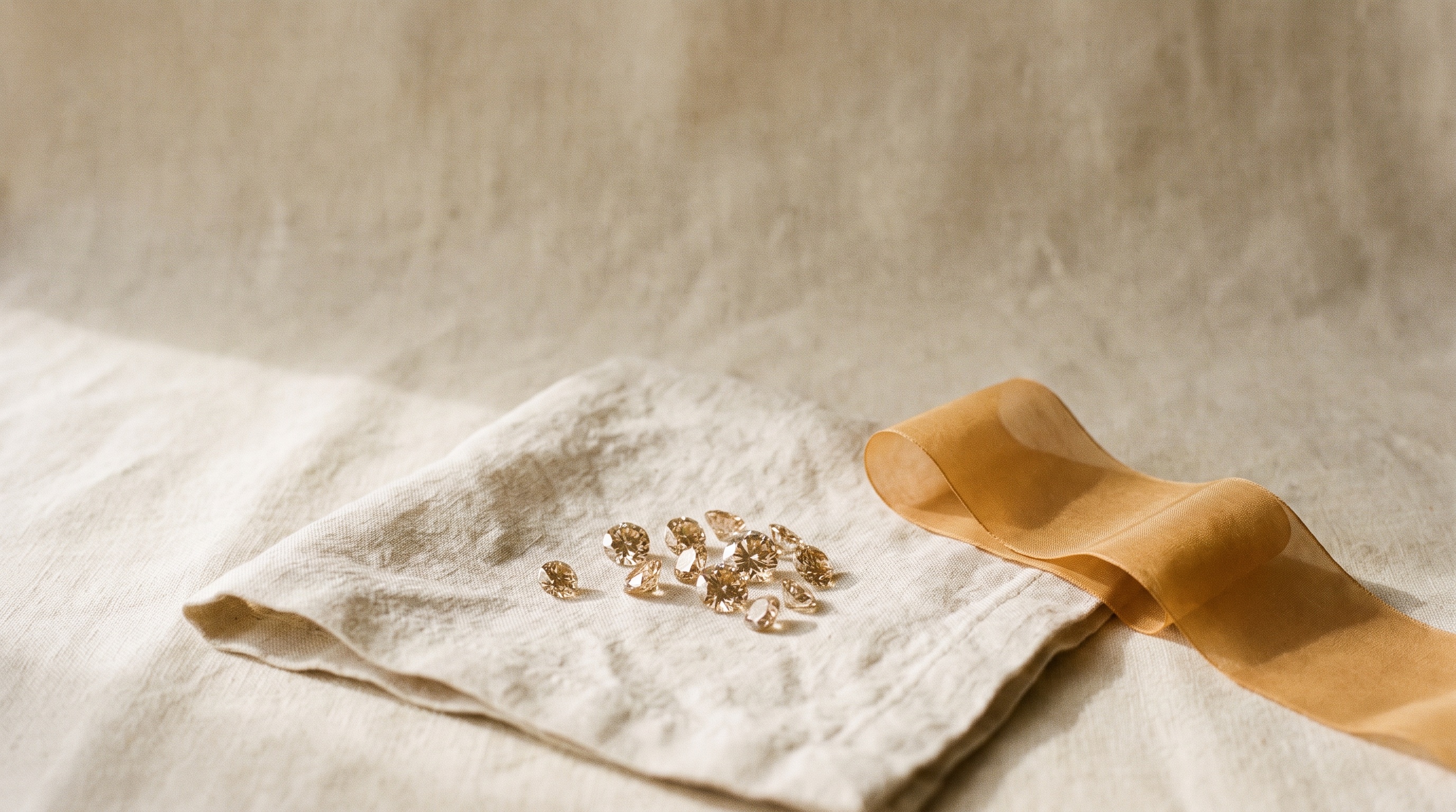
Face-up and mounted, a K color diamond typically reads as a light warm white or very pale champagne, rather than a "yellow diamond" in the fancy-color sense. The tint is even and diffuse across the stone rather than concentrated in one area, which is characteristic of body color as opposed to a localized inclusion. Under bright, cool (blue-toned) lighting the warmth becomes more apparent; under warm incandescent or candlelight, K color often blends in and can be difficult to distinguish from a whiter grade even for an experienced eye. This lighting sensitivity is one of the most useful practical facts to communicate to a buyer considering K color — the same stone can read noticeably different from one room to the next.
Settings That Help (and Settings That Don't)
Metal choice has an outsized effect on how K color presents:
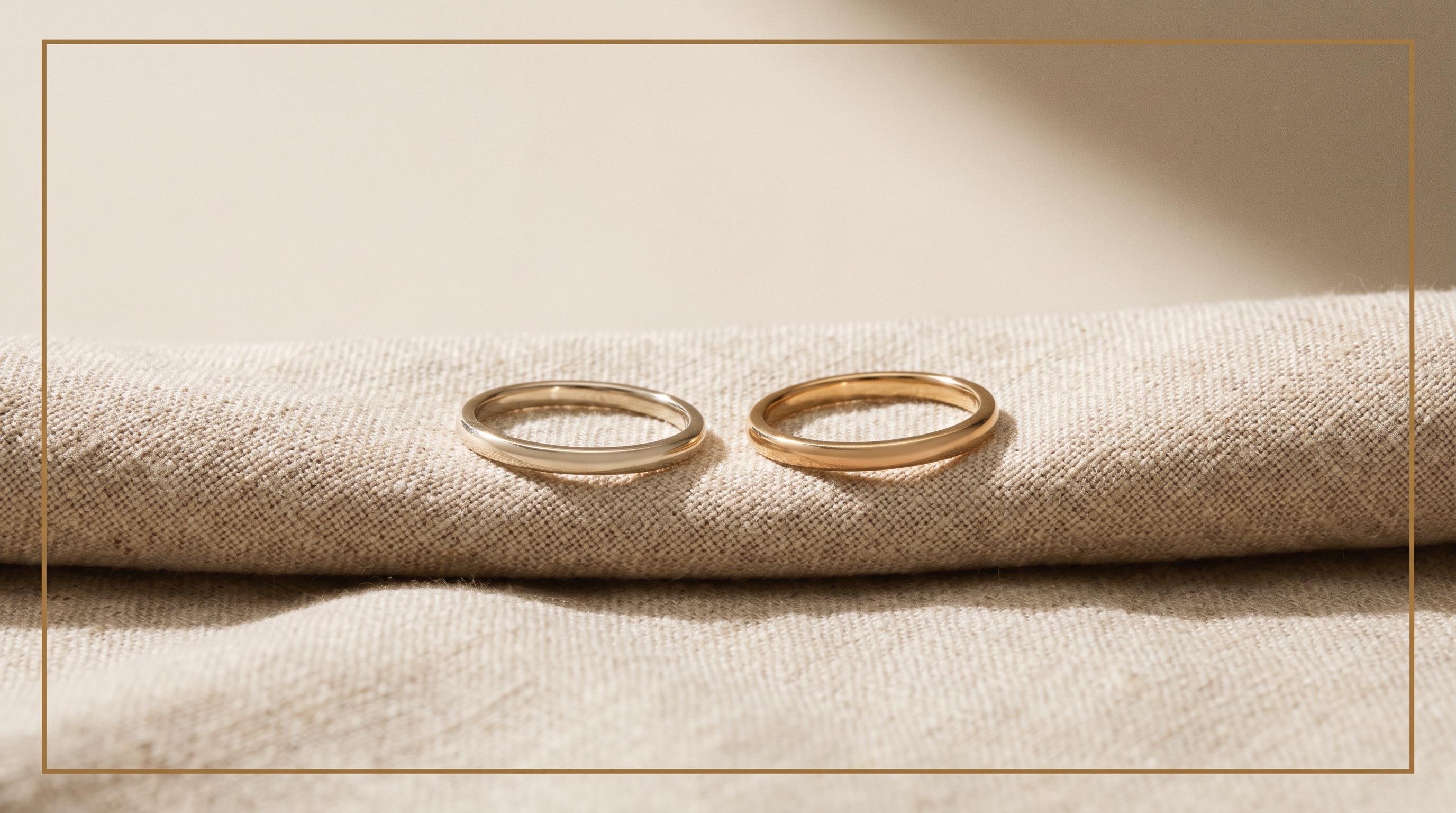
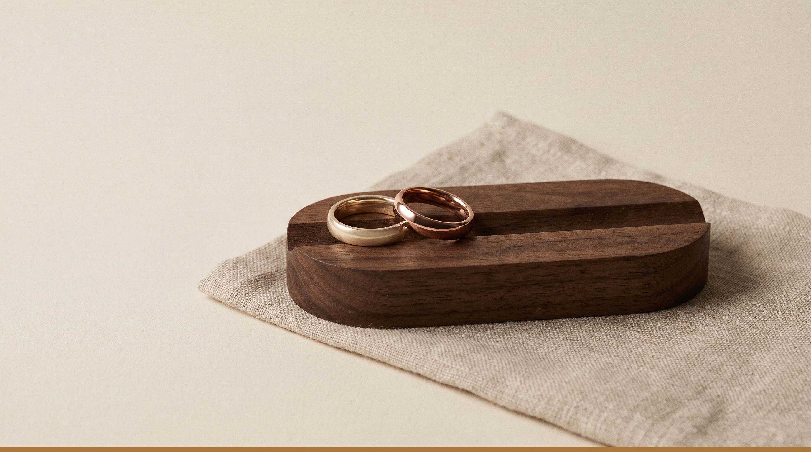
- Yellow gold and rose gold are the strongest match for K color. The warm metal tone harmonizes with the stone's own tint rather than contrasting against it, and many buyers who choose K color deliberately pair it with yellow or rose gold for exactly this reason — the combination often reads as an intentional warm-toned aesthetic rather than a compromise.
- White gold and platinum create the most contrast against K color, and it's the combination most likely to make the tint read as unwanted rather than stylistic. K in a white metal setting is still workable for buyers on a tight budget who prioritize size over color purity, but it's worth setting that expectation clearly before the sale.
- Antique and vintage-style settings — filigree, milgrain, bezel work — often pair well with K color regardless of metal, since these design languages already lean warm and textured, and a period-correct stone with some natural body color reads as authentic rather than a downgrade.
K Color vs. Nearby Grades
| Grade | Face-up appearance | Best setting | Value position |
|---|---|---|---|
| J | Near-colorless with faint detectable warmth | Yellow or rose gold recommended; white metal workable | Best value in near-colorless range |
| K | Faint, generally noticeable warm tint | Yellow or rose gold strongly recommended | Strong budget/size choice |
| L | Faint tint, more consistently visible than K | Yellow or rose gold, warm design language | Aggressive budget/size choice |
| M | Most visible tint within the faint range, borders on light champagne | Warm metal essential; best in vintage or statement designs | Maximum size-per-dollar within the faint tier |
The jump from J to K is where most buyers first notice a real change in the stone's baseline appearance rather than a subtle, comparison-dependent difference. That makes K a meaningful decision point: choosing K over J (or higher) is rarely accidental — it's usually a deliberate trade of color purity for carat weight, cut quality, or overall budget.
Carat Size and K Color: Why Bigger Stones Show More Warmth
Color is a body characteristic that accumulates with the amount of material light travels through, so a larger K color stone shows visibly more warmth than a smaller one at the identical grade. This scaling effect matters more at K than at higher grades, because K already starts from a noticeable baseline.
| Carat range | K color experience |
|---|---|
| Under 0.50ct | Warmth is present but modest; often reads as a pleasant warm-white in the right setting |
| 0.50-1.00ct | Warmth is clearly visible face-up in most lighting; still attractive in yellow or rose gold |
| 1.00-2.00ct | Tint becomes a defining visual characteristic of the stone; strongly favor warm metal and brilliant-cut shapes |
| 2.00ct+ | Color is a primary visual factor at this size; consider whether the warm-tone aesthetic is the intended look or move up a grade or two |
K Color and Fluorescence
Fluorescence — a stone's tendency to emit a soft glow under UV light — can meaningfully interact with K color. Strong or very strong blue fluorescence occasionally makes a K color stone appear noticeably whiter face-up under daylight or UV-rich conditions, since the blue glow can visually offset the yellow body tone. This effect varies significantly by stone and isn't something to guarantee to a client, but it's worth checking directly when evaluating a specific K color diamond that also carries strong fluorescence — the combination can sometimes outperform the color grade on paper.
Is K Color Diamond Good for an Engagement Ring?
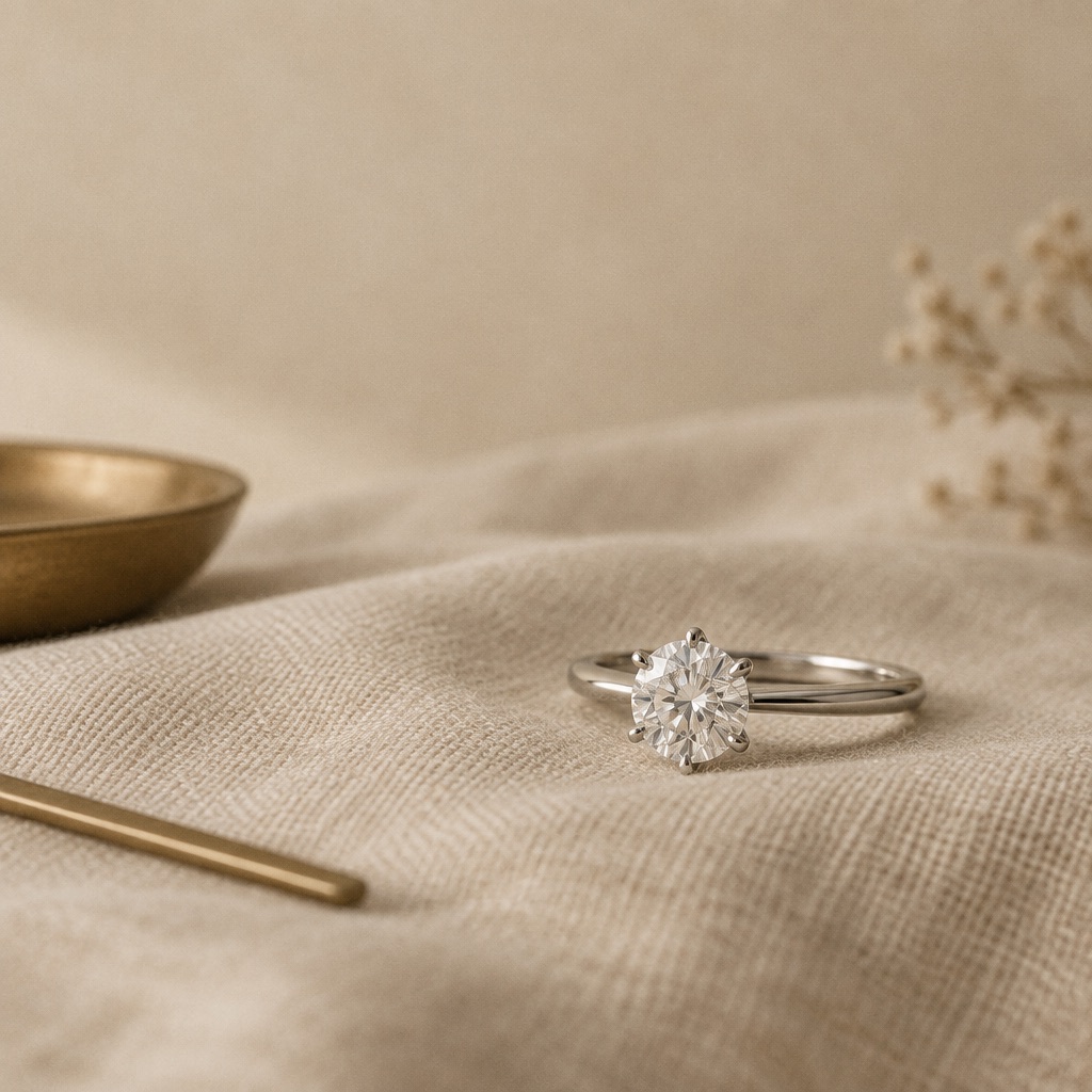
It can be, for the right buyer and the right design intent. K color works best in engagement rings when the setting is yellow or rose gold, the shape is a brilliant cut, the stone is under about one carat, and — most importantly — the buyer either likes the warm tone as an aesthetic choice or is prioritizing size and budget over color purity as a conscious trade-off. Where K color creates the most buyer's remorse is when someone chooses it purely to maximize carat weight in a white gold or platinum setting without understanding how visible the tint will be against a cool-toned metal at a larger size. Setting clear expectations up front — ideally with a real side-by-side comparison against a whiter grade — heads off nearly all of the dissatisfaction that comes up with K color purchases.
K Color in Lab-Grown vs. Natural Diamonds
Color grading methodology is identical between CVD lab-grown and natural diamonds — the same D-to-Z scale, applied by the same major labs using the same master-stone comparison process under controlled lighting. K color lab-grown diamonds carry the same visual characteristics as K color natural stones, and the buying guidance above (favor warm-tone metal, understand the carat-scaling effect, check fluorescence) applies equally to both.
A Practical Framework for Recommending K Color
For jewelers advising clients, K color earns a genuine recommendation when at least two of the following line up: a yellow or rose gold setting, a brilliant-cut shape, a stone under roughly one carat, and a buyer who has directly compared K against a whiter grade and prefers the value trade-off. Outside that combination, moving up to grade I or J typically buys meaningfully more color security for a modest price difference. The most reliable way to set a client up for satisfaction with K color is showing it next to a higher grade in person or in comparison photos before the purchase, not describing the difference in the abstract.
Common Misconceptions About K Color
- "K color is basically a yellow diamond." K is a faint-tinted white diamond, not a fancy color stone — fancy yellow diamonds are graded on an entirely separate scale beyond Z and have a distinctly stronger, more saturated color than K's subtle warmth.
- "K color always looks bad." In the right setting — warm metal, brilliant cut, appropriate size — K color reads as an intentional warm-white stone, not a flawed one. Many buyers choose it specifically for that look.
- "Cut doesn't matter once you're in the faint color range." Cut quality still meaningfully affects how bright and lively a K color stone looks; a well-cut K can outperform a poorly cut J in overall visual appeal.
How Color Grading Actually Works
GIA color grading is performed by trained graders comparing an unmounted diamond, viewed table-down, against a set of master stones with verified color grades, under controlled daylight-equivalent lighting. This face-down, unmounted condition is deliberately the most revealing way to assess color, which is also why a diamond's grading-condition appearance and its everyday, mounted, face-up appearance can differ. Master stones anchor each grade boundary, and multiple graders typically weigh in on borderline calls — part of why a certified color grade from GIA, IGI, or GCAL carries more trust than an uncertified seller's own assessment, especially at grade boundaries like the J/K line where a small shift in judgment changes the category entirely.
Color grading captures body color specifically, independent of fluorescence, which is graded and reported as a separate field even though the two occasionally interact visually as covered above. A grading report lists them separately because they're independent characteristics of the stone.
Why K Sits Where It Does: The Faint-Range Boundary
The faint range (K-M) exists because color perception is a gradient, not a hard cutoff, and graders need workable category boundaries within that gradient. K earns its place at the top of the faint range because, while its tint is genuinely visible under most conditions, it remains the mildest and most manageable expression of that visibility — closer in practice to the near-colorless boundary than to M's more pronounced warmth. Understanding this distinction helps explain to a client why K color, while technically several categories away from colorless, can still look attractive and intentional in the right piece.
K Color and Cut Quality: A Bigger Lever Than Most Buyers Realize
Cut quality has an outsized effect on how K color reads. A diamond cut to strong proportions returns more light through the crown, creating brightness and scintillation that can visually offset a warmer body color — a well-cut stone "reads whiter" than its technical grade suggests. A poorly cut stone at K color, by contrast, looks duller and lets more of the tint show through a larger, less lively table facet. For a K color diamond specifically, prioritizing an Excellent or Ideal cut grade does more to keep the stone looking bright than trying to chase a slightly higher color grade on a mediocre cut.
Comparing K Color Across Different Diamond Shapes
Some shapes handle K color better than others:
- Round brilliant is the most forgiving shape for K color, with the most effective light-scattering facet pattern of any cut, helping mask warmth most effectively.
- Cushion and oval perform reasonably well, close to round, though larger ovals can show slightly more color concentration toward the pointed ends.
- Princess cut tends to hold color somewhat more visibly in its corners, worth a closer look on larger princess-cut K color stones.
- Emerald and asscher (step cuts) are generally the least forgiving shapes for K color — their broad, open facets show body color more readily than brilliant-cut shapes, and step-cut K color is a combination worth evaluating carefully in person before committing.
K Color for Side Stones vs. Center Stones
Color-matching between a center stone and its side or accent stones matters more than the absolute grade of either individually. A whiter center stone paired with K color side stones can look visually inconsistent, so either matching side stone color closely to the center or deliberately choosing K throughout for a unified warm-toned piece tends to look more intentional than mixing grades without a plan. For melee and pavé work, color grade requirements often relax further than for a center stone, since very small facets minimize how much body color reads at that scale.
Evaluating a Specific K Color Stone Before Buying
Because K color sits at a genuine visual threshold, the grade letter alone tells less of the story than it does at higher color grades — two K color stones can present noticeably differently depending on the specific hue (some lean more yellow, others more brown), the cut quality, and the shape. A few practical steps make the difference between a confident K color purchase and a risky one: request a photo or video of the stone under both daylight-equivalent and warm indoor lighting, ask whether the tint leans yellow or brown (most buyers find yellow more universally flattering than brown at this grade), and where possible, view the stone next to a whiter reference grade rather than judging it in isolation. A certified report confirms the grade, but it doesn't convey hue character the way a direct look or a well-lit photo does — for K color specifically, that extra step is worth taking before finalizing a purchase, especially for a center stone in a significant commission.
K Color and Resale or Upgrade Considerations
Buyers occasionally ask how color grade affects a stone's long-term value or upgrade path. K color diamonds generally hold a lower resale value than near-colorless grades, consistent with their lower purchase price — this isn't a downside specific to K, it's simply how the color-price gradient works in both directions. For jewelers running trade-in or upgrade programs, it's worth setting the expectation early that a K color stone purchased primarily for size or budget will typically trade toward another value-tier stone rather than a premium colorless one, unless the client specifically wants to move up the color scale as part of the upgrade. This is a normal, well-understood pattern in the trade rather than a reason to avoid K color for buyers who value it for what it offers today.
Regional and Cultural Preference Variance
Tolerance for warmer color grades like K varies meaningfully by market and by individual taste. In some regions and among some buyer segments, a warm-toned diamond in yellow gold is a preferred, traditional look rather than a budget compromise — the pairing is chosen for its aesthetic, not despite it. In markets or client bases that strongly favor an icy-white, colorless look (common in many contemporary engagement ring markets), K color needs more careful framing and is better suited to accent stones, vintage-inspired pieces, or clients who've explicitly said budget or size matters more than color purity. Understanding which category a given client falls into before recommending K color avoids most of the friction that comes up with faint-range grades.
K Color for Antique and Vintage-Style Jewelry
K color has a natural home in antique-cut and vintage-inspired jewelry, where a small amount of warmth reads as period-authentic rather than as a flaw. Old Mine and Old European cut stones, which historically weren't cut to maximize colorless brilliance the way modern round brilliants are, were routinely set with warmer body color even in fine pieces — a K color old mine cut in yellow gold with a button-back collet genuinely echoes how these stones were sourced and worn a century ago, rather than approximating the look with a modern colorless stone in an antique-style mounting. For jewelers building or sourcing antique-inspired pieces specifically, K color (and its close neighbors J and L) is often a better aesthetic and budget fit than pushing for the highest available color grade, which can look slightly out of place against genuinely antique design details.
Frequently Asked Questions
Can you tell K color apart from a whiter diamond just by looking at it?
Usually yes, especially in bright or cool-toned lighting and in stones over half a carat. K color's tint is more consistently visible than near-colorless grades, though warm lighting and yellow gold settings can minimize the difference.
Is K color a good value?
Yes, for buyers prioritizing size or budget who are comfortable with a warm-toned stone, particularly in yellow or rose gold settings with brilliant-cut shapes.
What's the best setting for a K color diamond?
Yellow gold or rose gold, which blend with the stone's warmth. Antique and vintage-style designs also tend to complement K color well regardless of metal.
Does K color look worse in a bigger diamond?
Warmth becomes more visible as carat size increases because light travels through more material. A K color stone under half a carat reads much milder than the same grade at two carats or more.
Is K color the same as a fancy yellow diamond?
No. K is a faint-tinted white diamond graded on the standard D-Z scale, while fancy yellow diamonds have a distinctly stronger, more saturated color and are graded on a separate fancy-color scale.
How much cheaper is K color than near-colorless grades?
K typically carries a meaningful price advantage over G-J, continuing the steady price gradient that runs down the color scale — one of the main reasons buyers choose it deliberately for size or budget.
Sourcing K Color from Guru Diam
Guru Diam stocks a full color range including K across our certified loose diamond inventory, CVD lab-grown with IGI, GIA, and GCAL certification available. Our team can help match color grade to setting metal, shape, and carat weight for a specific commission — particularly useful for larger stones or step-cut shapes where the color decision carries more visual weight. In-stock inventory ships same-day from New York or Los Angeles, our custom jewelry program finishes pieces in 4-6 days from CAD approval, and trade accounts can review our full color and shape matrix through the wholesale hub or a trade partner account.
Every stone we carry, K color included, ships with its full GIA, IGI, or GCAL grading report, and our team can pull side-by-side comparison images against higher color grades on request — the most reliable way to set a client's expectations correctly before committing to a specific grade. For commissions where setting metal, shape, and size all interact with the color decision, we're glad to walk through the specific combination directly with your team.